
Though packed bars is new, the challenges it addresses are not new. But those challenges are becoming more pressing as data sizes get larger. Here are some old and new alternatives for similar data with values in hundreds of categories, often skewed.
All alternatives are shown with the same data set, the billion-dollar weather disasters collection from NOAA. The values have a skewed distribution, which suits packed bars well. Other chart forms will do better with less-skewed distributions. In any case, which alternative is “best” depends on which message you are trying to communicate or question you are trying to answer with the chart.
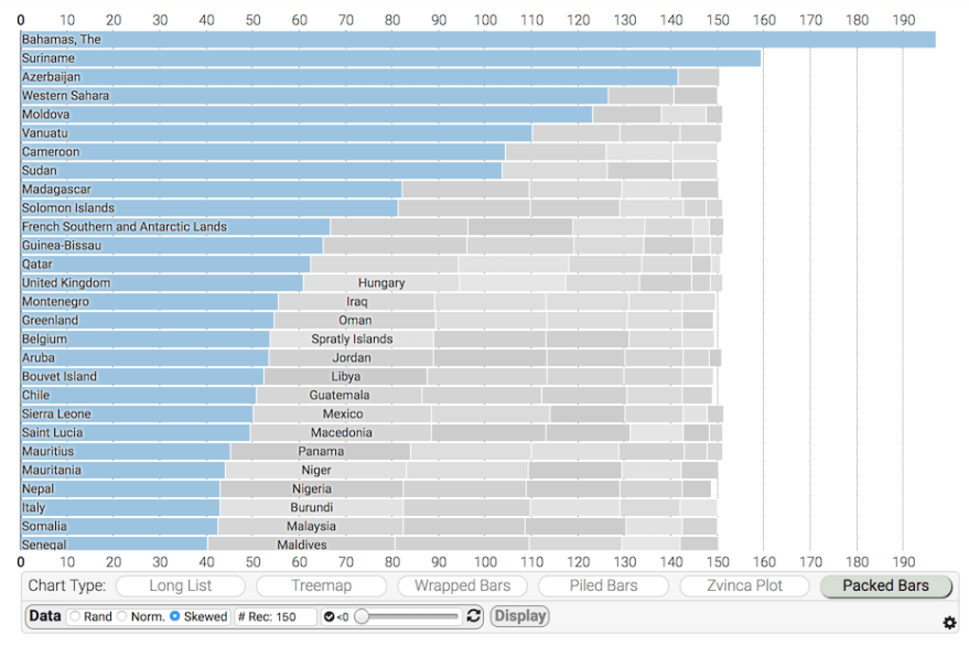
Although these examples are static images, all of the charts can benefit from interactivity such as hover labels and selection linking.
Packed bar chart
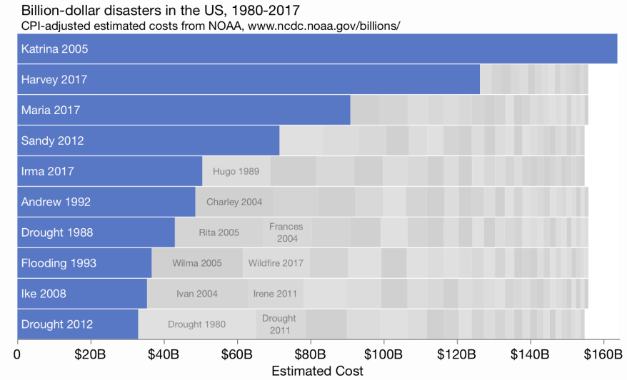
We can see the top values clearly. Labeling and fidelity of the secondary values are intentionally sacrificed, but the aggregate sum is indicated by the total area, which allows some part-to-whole approximations.
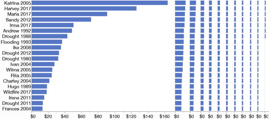
Regular bar chart
A bar chart of the full set of 227 values would be very tall or have very skinny bars with unreadable labels. This is the problem the other alternatives are trying to address. Rotating the plot allows it to fit better in this page.
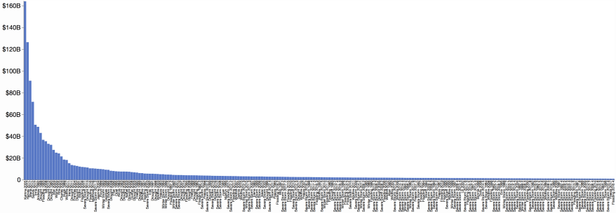
In this reduced form, the full bar chart does have one strong feature: it’s easy to see the shape of the value distribution.
There are two common variations to avoid a very long chart:
- embed the chart in a scrolling view, requiring interaction to see all the values, and
- truncate the chart, only showing the top 10 or so values, which would be just the focus part of a packed bar chart.
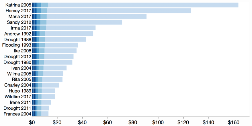
Dot plot
A statistical dot plot and related one-dimensional scatter plots (such a strip plot) represent the values by position along an axis. They typically use a dodging technique such as stacking or random jitter to reduce overstriking. 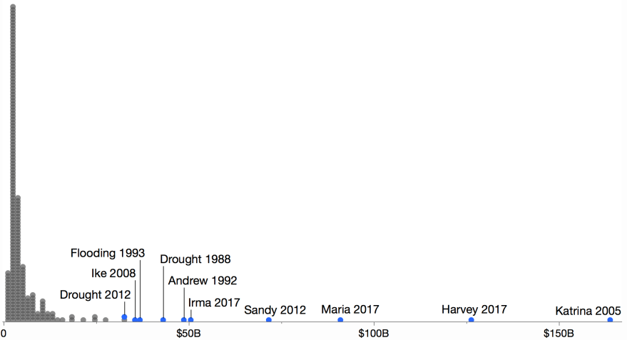
Labeling is a challenge and often requires hand-tuning with only the top values having room for labels. The value distribution is clear, but a skewed distribution means the bulk of the chart space is consumed by the small values.
Treemap
Though treemaps were designed for hierarchical data, a flat treemap can efficiently display many values. When a rank-preserving layout such as squarify is used, a treemap can support the Focus+Context principle.
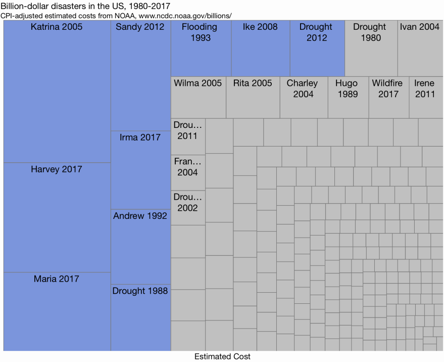
By using two-dimensional area to represent the values, a treemap can distinguish a wide range of values. However, in general, area is less accurately perceived than position or length, and there is no axis, so values often need to be added to the labels.
Wrapped bars
Wrapped bars slice the values into ranked groups. The groups are placed side-by-side in columns. Since the values are ranked, successive columns need less and less space, enabling a compact view with all the bars on the same scale.
Wrapped bars should be easier for new readers to interpret, and secondary values are easier to compare since the bars of nearby values share a common baseline. Only the labeling might be confusing, with only one column of values labeled at a time. The whitespace between columns and after the smaller bars leads to a lower visual resolution.
Piled bars
Like wrapped bars, piled bars, slice the values into ranked groups. Instead of arranging the groups in columns, the groups are overlaid (piled) on top of each other. Below is a crude approximation of a piled bars view. In particular, the in-place labeling and shading are lacking in this approximation.
Labels are normally inside each bar aligned with the right edge, and shading is added to help show the piling. Piled bars work better for a less skewed distribution of values. Here, the small values leave no room for labeling.
Zvinca plot
A Zvinca plot is like a piled bar chart using dots instead of bars.
Dots eliminate the need for visual shading, but make labeling more difficult. It’s unclear which dots go with the labels. As described in the linked article, the user can dynamically control which group of values get labeled, but the labels stay on the left side.
Packed bubbles
Like a treemap, packed bubbles use area for the value encoding, though with circles instead of rectangles.
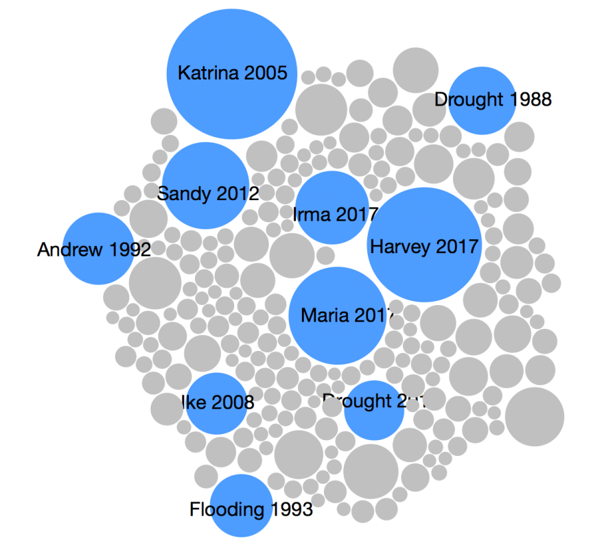
Like with treemaps, using area helps with the range of distinguishable values but is less accurate and lacks an axis. The layout is not generally deterministic, and labeling can be a challenge with smaller bubbles.
Interactive comparisons
A chubuk.js page lets you cycle through many of the above alternatives with the a few data sets.
The controls at the bottom let you pick from few data sets, and the slider controls how many negative values there are. Packed bars weren’t designed for negative values, but the implementation seems reasonable.
