Packed bar charts are useful wherever there is skewed data with many categories and especially where the part-to-whole indications are meaningful. A few are listed here, but the Wikipedia list of applications of the Pareto distribution suggests many other applications.
Quality Control
In quality control, a packed bar chart serves as a scaled up Pareto chart for defect counts, which are often skewed. This quality control data set of 200 anonymized production sites highlights the sites with the top defect amounts within the context of all the other sites.
The traditional Pareto-style version is to stack the secondary values into an “other” category, but for this many categories the other bar can swamp the primary bars. Even extending the primary count from 10 to 15, as shown here, still exhibits the problem.
Medicine
Like many rare events, counts of disease or symptom occurrences often follow a skewed distribution. Here are the counts of 200 adverse events from a clinical trial of the drug nicardipine.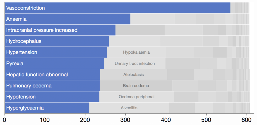
Finance
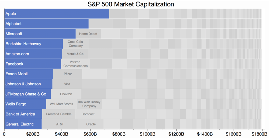
Financial data is often skewed and supports aggregation. Here are the market capitalizations of US S&P 500 public companies.
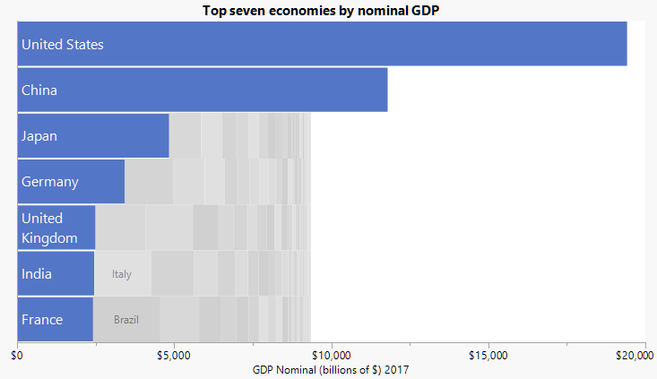
Here are GDPs of 200 world economies.
Nature
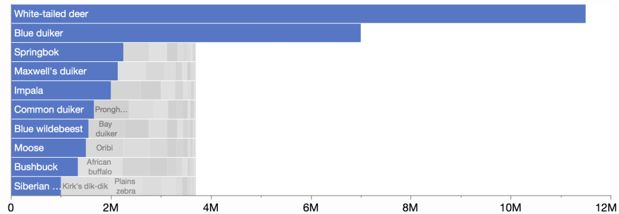
The weather disasters example is one demonstration of natural phenomena with skewed distribution. Another is this chart showing population by species for undomesticated hoofed animals.
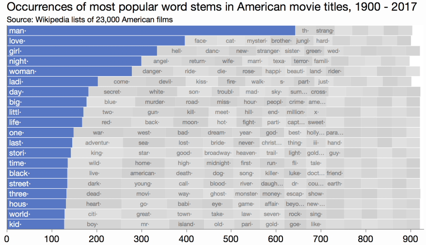
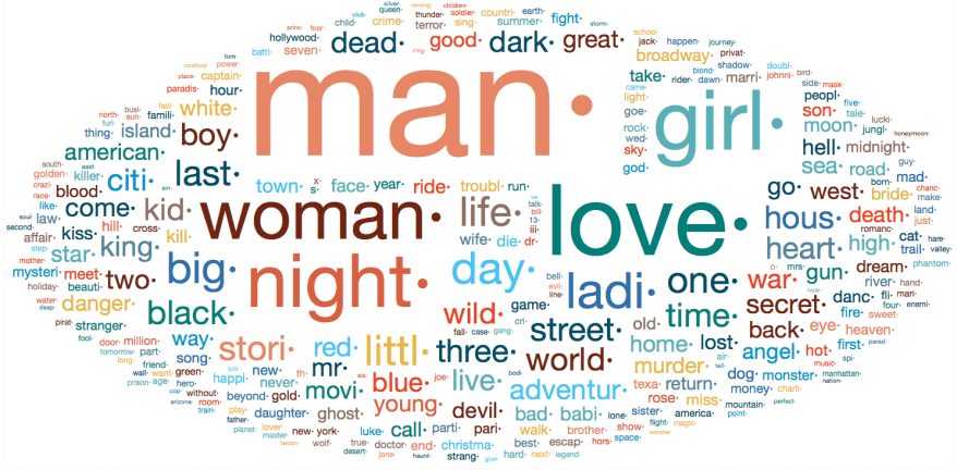
Text
Word distributions in text analytics are often skewed, and packed bars can make a good alternative to a word cloud. The bars make it easier to understand the distribution of the top words, at least.