
Primary and secondary
The design of the packed bar chart is centered on the Focus+Context principle, which makes visualizing large data sets manageable. In particular, we don’t need to graphically encode all the values with equal quality. In packed bars, the values are divided into “primary” and “secondary” values. The top N values are the primary values, and the smaller values are secondary.
Packing algorithm
The video below shows the transition from a regular bar chart to a packed bar chart. Bars are placed in order of decreasing size. The top bars go along the left size. After that, there is only one rule that is applied repeatedly for each value: the next largest bar is placed on what is currently the shortest stack.
This packing algorithm has two desirable properties. The right edge is fairly even, and items are ordered by size left to right.
Choice of number of rows
The number of rows is the only parameter for the packing algorithm. For up to a few hundred values, it’s often good to set the number of runs to a user-friendly value like 10, which matches existing practice for truncated bar charts and allows for easier percentage and grand sum approximations.
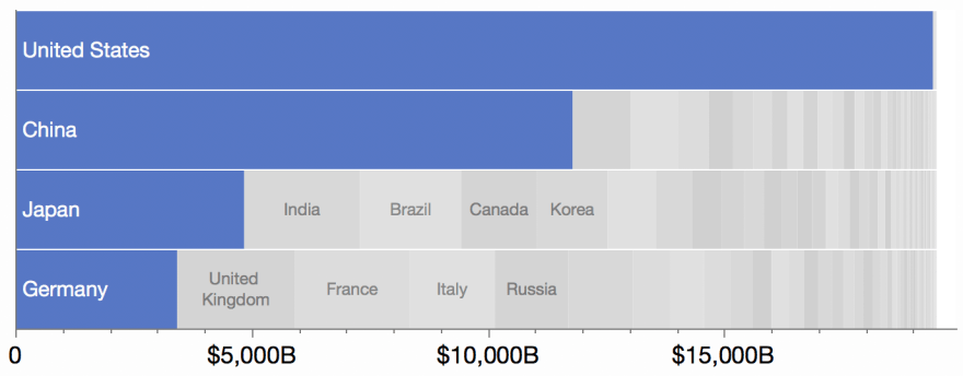
Another strategy is to base the number of rows on the proportion of the top value to the whole. In this chart of 2017 GDP by country, the US has about 1/4 of the world GDP, which is highlighted by the use of four rows.
Coloring
The default view uses a fixed color (blue) for the top values and random grays for the other values. By mixing up the grays, there is no need to delineate the secondary bars with frame lines, which would overwhelm the smaller bars.
Labeling
The default labeling puts the primary labels inside the bars, left-aligned for easier scanning. Some of the secondary bars are labeled with smaller centered text. See the variations page for more labeling options.
